Overview :
We were tasked with helping Fight2Feed in expanding its mission to include educating people from all walks of life about nutrition, food waste, food security, and sustainability. Fight 2 Feed was looking for help identifying opportunities to leverage technology (given that it’s in Chicago) to move people to action.
Team :
I worked on a team of 3
Tools :
Figma
Procreate
Traditional tools
Google forms
Google Slides
Methods :
Business Analysis
Open Card Sort
Heuristic Analysis
User Surveys
User Interviews
Affinity Mapping
Comparative Analysis
Competitive Analysis
Usability testing
Problem Statement :
Fight to feed needs citizen to take part in, and get educated about the fight against food waste and food insecurity in an individual way.
Solution Statement :
A financially conservative redesign of the website that educates on the issues, builds a volunteer community, and promotes action that enable individuals to take part in the fight against hunger in an individual way.This is achieved by augmenting the content strategy, reorganizing the information architecture, streamlining user flows, and adding functionality to support new objectives.
Storyboard:
i drew this story board to show the solution in action.
Balancing Business Needs with User Needs
Client:
Financially conservative solution
Engage users
Drive conversions
User :
Low burden tech solution
Information about the issues
Community of other volunteer
Streamlined way to volunteer
Research:
User Survey
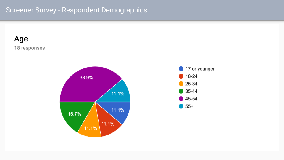
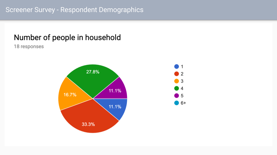
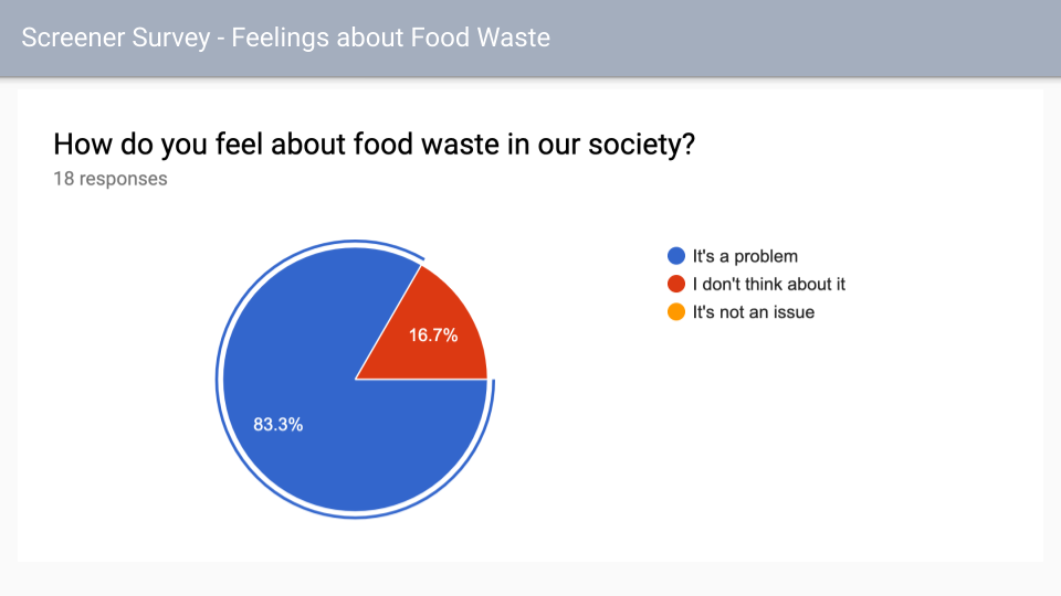
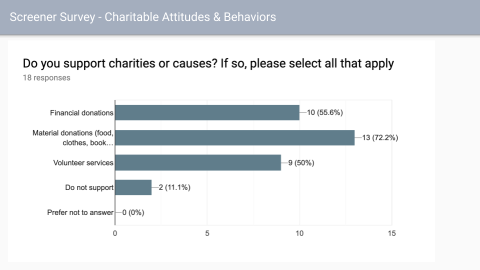
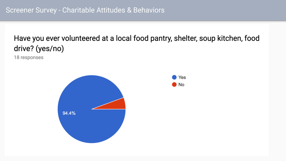
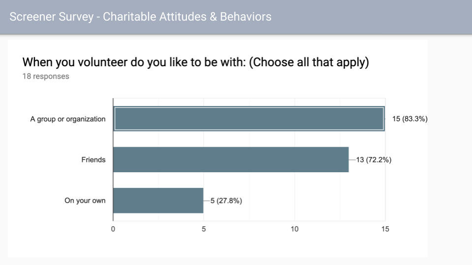
our team sent out a Survey to gage people's understanding of the food scarcity issue as well as their current volunteering activities. From these results we created a more specific questions for follow up interviews.
I took on the task of looking in to Apps that functioned in the same space. one of the biggest stand out things I noticed was most of these apps weren't available locally. though a lot featured a measurement of progress of the work of ether the organization or the individual users efforts.
User Interviews
We conducted interviews with five different user of varying backgrounds. these are notes from an interview I conducted. to our surprise we found that users had little interest in adding another App to their phone. So we had to reconsider how our solution would look.
Analysis:
Affinity Mapping:
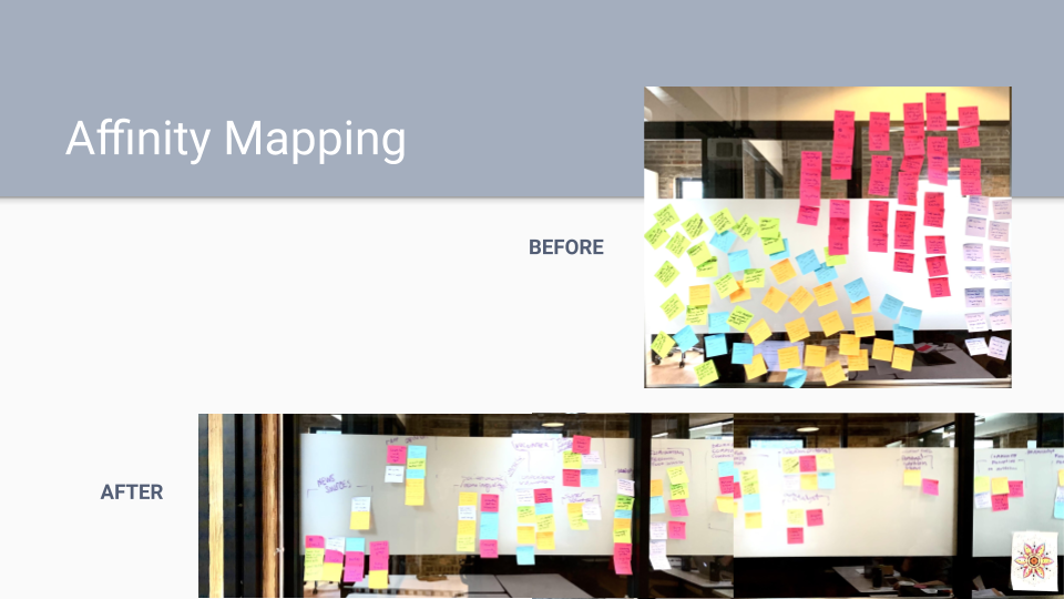
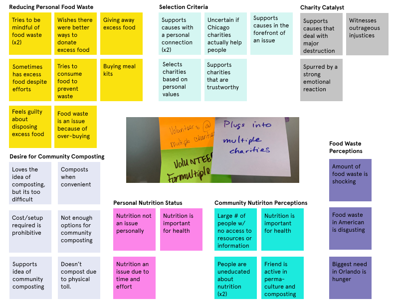
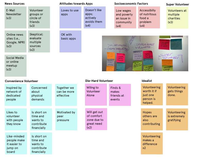
Our first move was to Put together an Affinity Map to synthesis I research. At this point I was really unsure where the research was leading us, and to be honest was still dead set on an app solution. Though it was still to early for that so, I decided to try to topic map it first and lead on my team mates for help getting a more specific view of trends in the data.
Empathy Map And Target User:
From there our target user was developed the Conscientious Citizen. the Illustration is by yours truly.
Feature Prioritization:
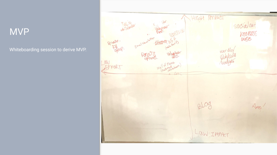
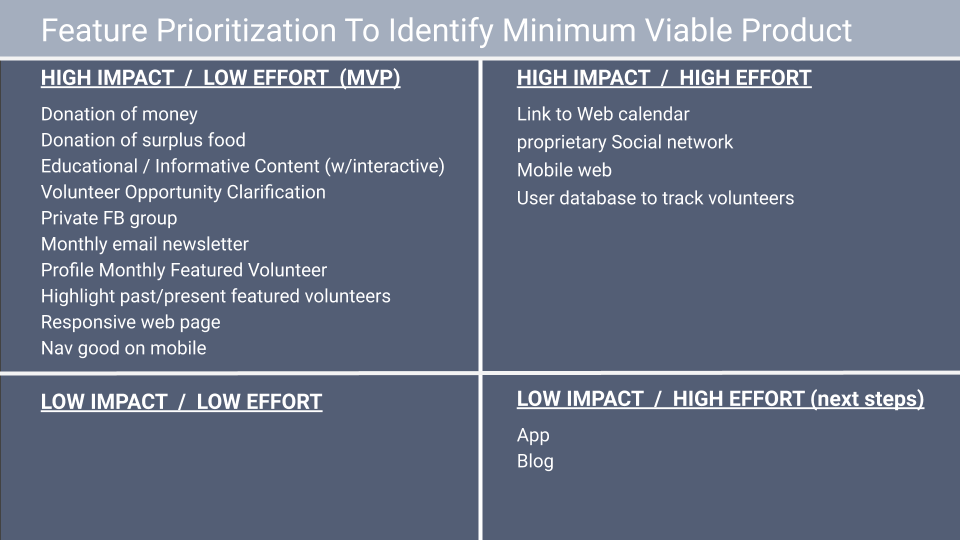
With the information from are interviews we did some white boarding to determine what our Minimum Viable Product would be, At these point it stated to really hit home an app wasn't our best bet but a website seemed to go against the users need for a solution that fit into a busy life style
Develop:
That's when we got it. It occurred to me that users mentioned ether being apart of newsletters or regularly checking their email. The best Solution seemed to be a monthly email newsletter that would encourage users to engage with a responsive mobile site. This would keep the user informed on a regular bases without an app and easily fit into their normal flow. My teammates were thinking the same thing ,so we go to work.
Sketching:
we started by sketching out ideas, then combining the ideas we liked into the final design.
I took on the design of the newsletter specifically.
Sitemap:
The site map of the current site
our first iteration of the redesigned site map
Design:
we built our donation forms in to the site itself.
the original site moved you away form the site and didn't let you donate food.
we created different forms for donating food and money, aswell as different forms for volunteering for different task. I designed the food donate form.
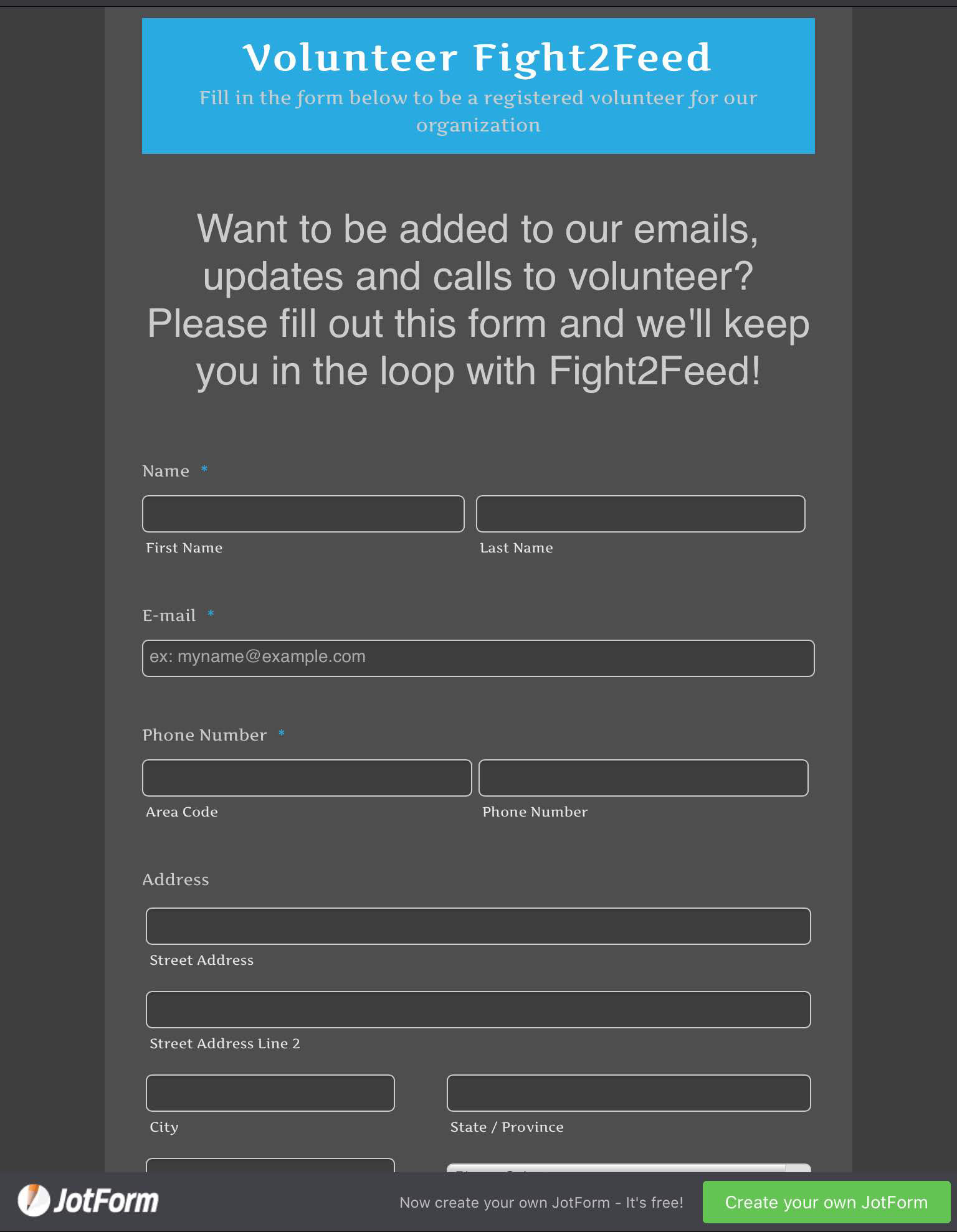
form on the site now
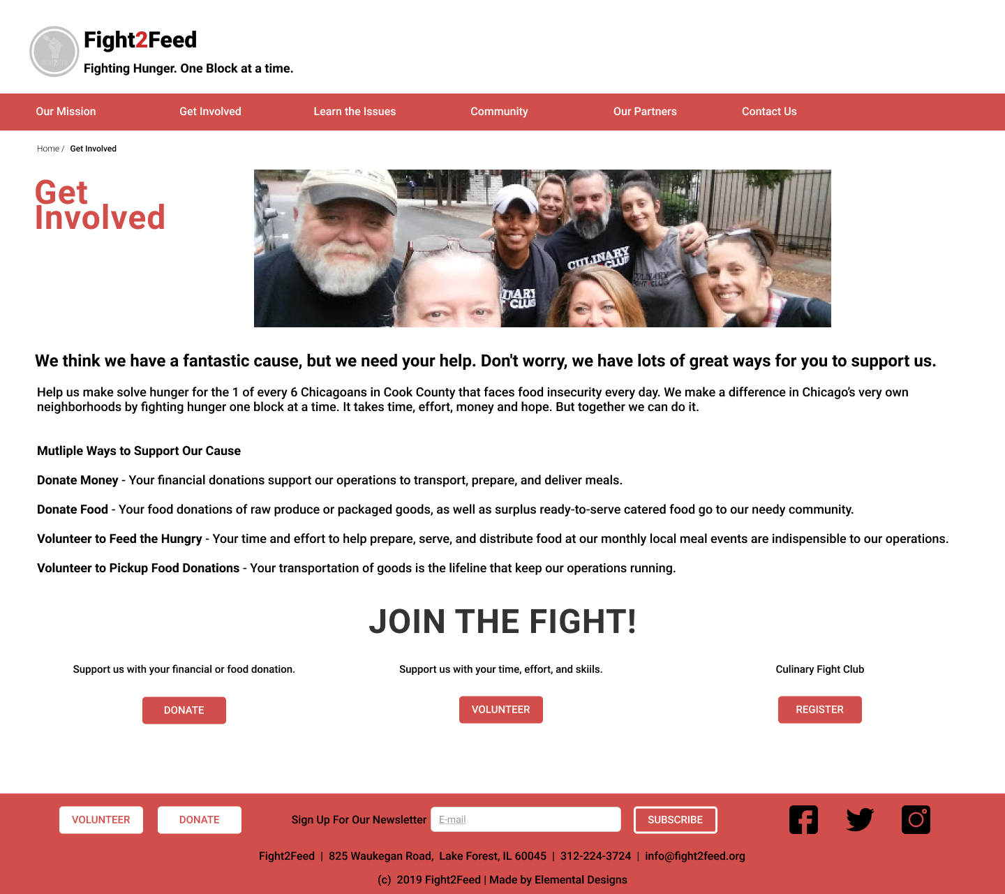
the portal for forms on our version
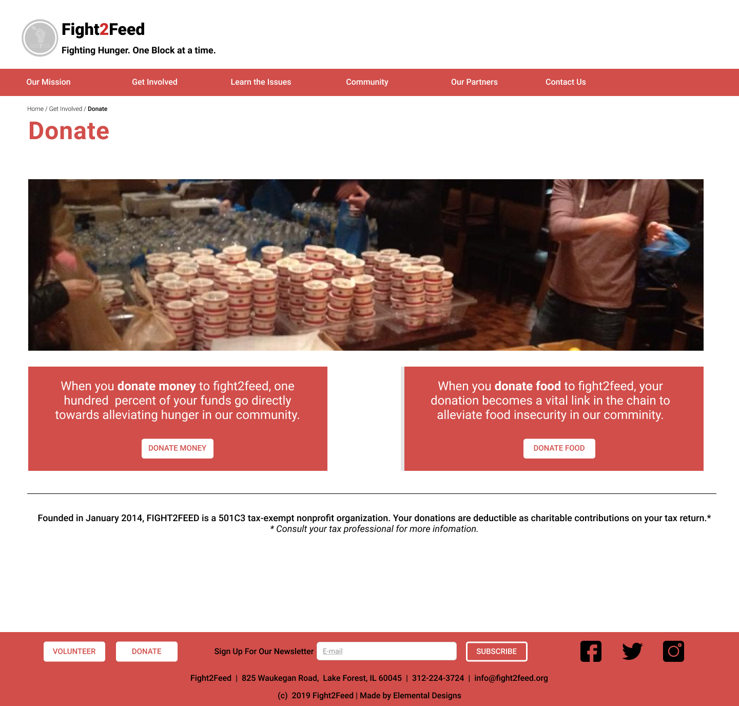
this clearly indicates what type of donation your making.
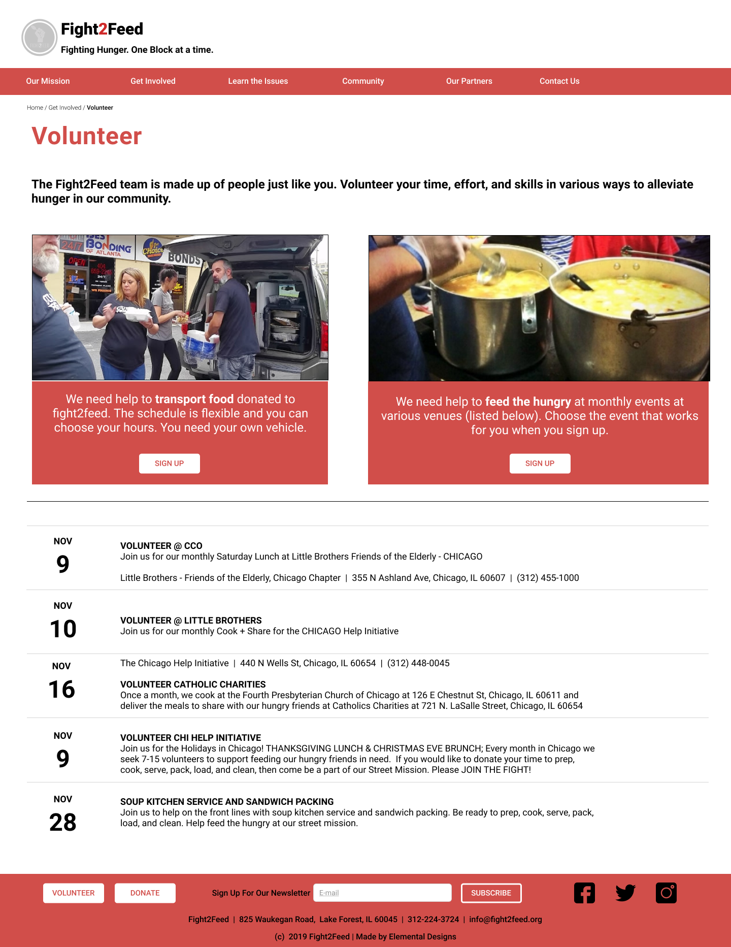
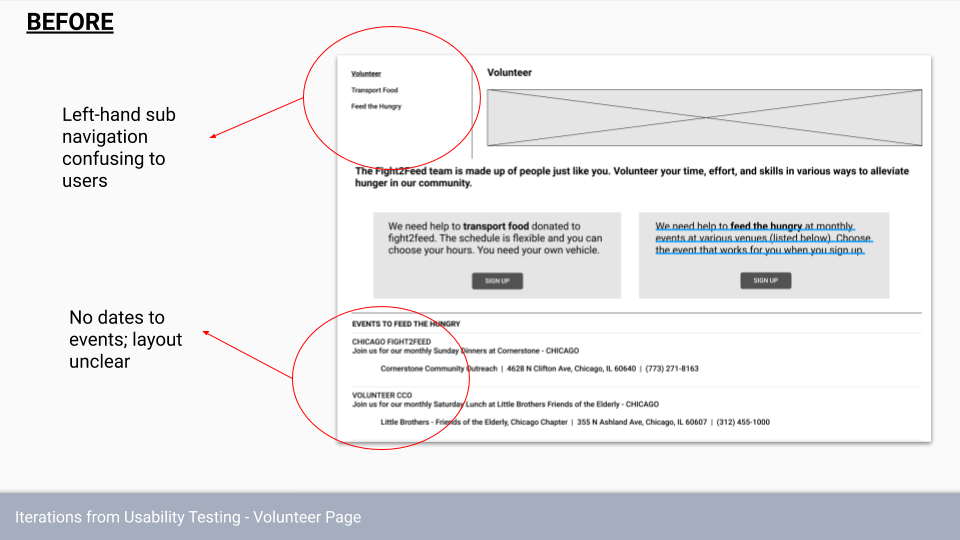
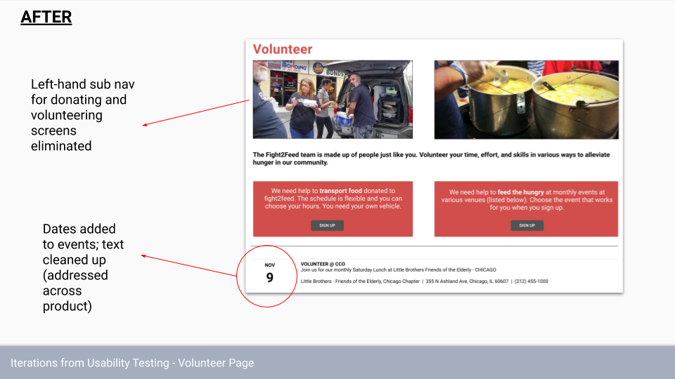
this lets the user decide how they want to volunteer their time, and give them a good idea of the dates before deciding. with images to help them know whats expected.
the original site was much less clear on what you were signing up to do. we made a concerted effort to make volunteering task and donation clear and easily understandable. we made sure there was a donate and volunteer button in the footer because it was the main action of the site.
before.
I took it upon myself, with the blessing of my team of course, to take on the visual design aspect. I wanted to keep the original sites, red black and white color scheme, because it's a classic color combo that carry serious and intense energy. Fight 2 feed defiantly want to create a sense of urgency around the issue.
While a goal for our Client was to educate the masses on the growing food scarcity issue, their site was a bit, well, scarce on information we took it upon ourselves to create full set of educational pages.
here is the Newsletter I designed. Highlighting upcoming events, so that the user has a reasonable amount of information, with pictures of the previous event to activate a little FOMO in the user. Giving people a since how much is being saved to there the user knows their efforts are worth it. Give a tip of the month for saving food, and a fighter of the month to encourage users to get involved. After each section I placed a red action button to encourage the user to visit the main site and get involved.

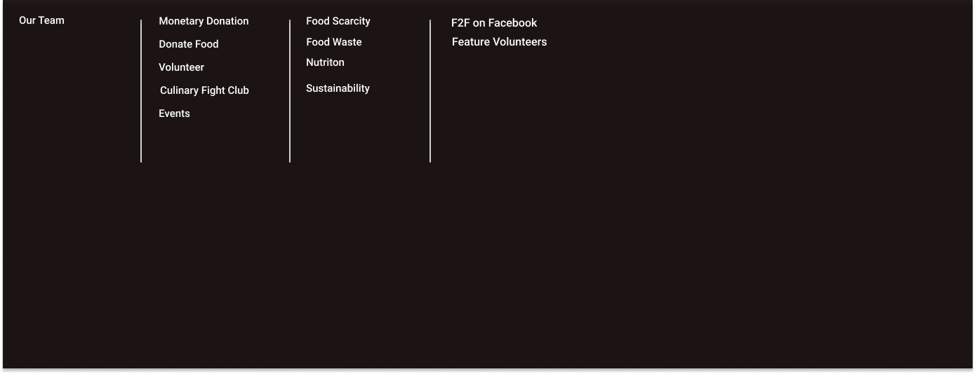


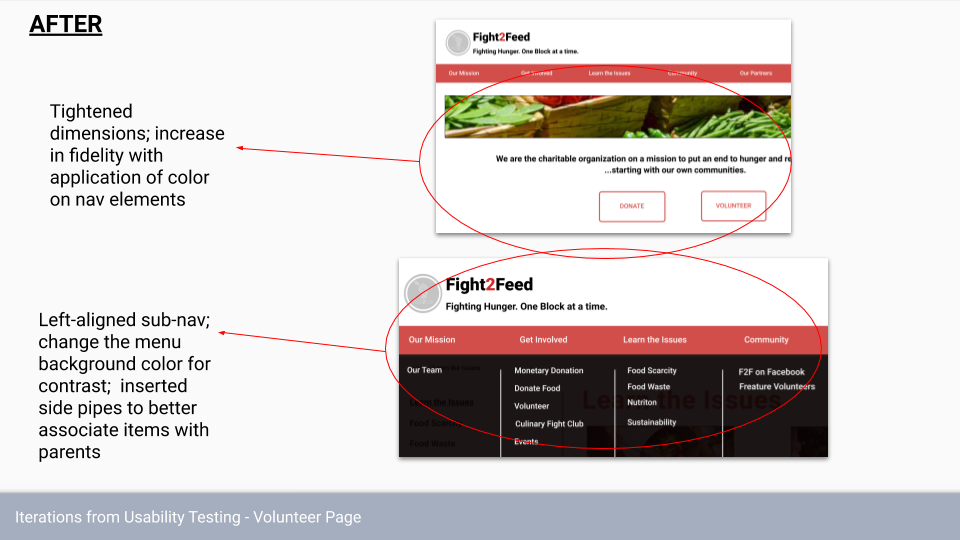
A sticky Header and Footers were added with a drop down to make navigation easy on the user. The footers feature obvious volunteer, donate and subscribe action buttons as well as basic contact information so that these are always accessible to the user.
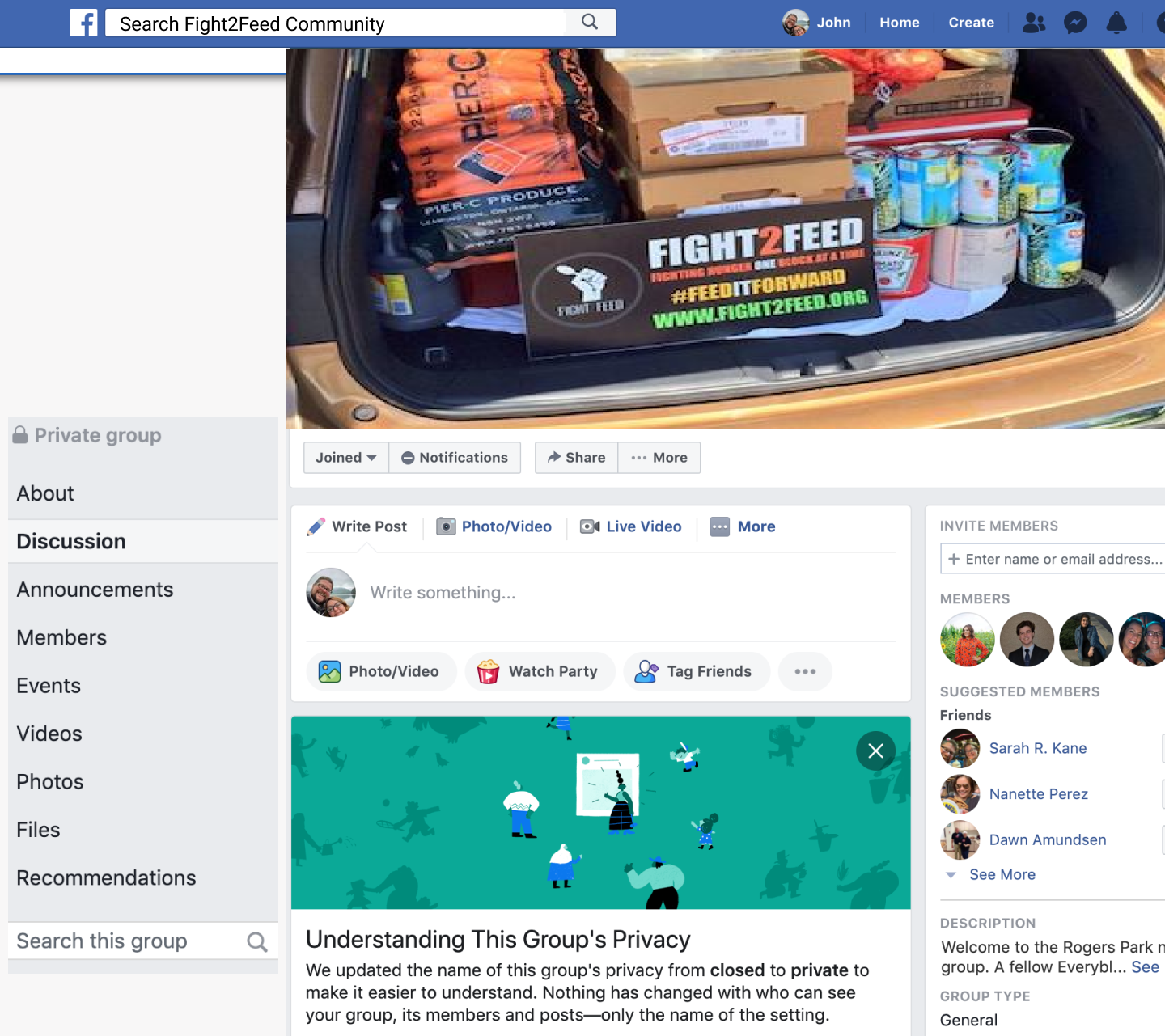
we had to think about not only the goals of the business but their budget. with that in mind we suggest a Fight 2 Feed Facebook group linked directly to the main site. this would be low effort to maintain and little cost.
Usability Testing:
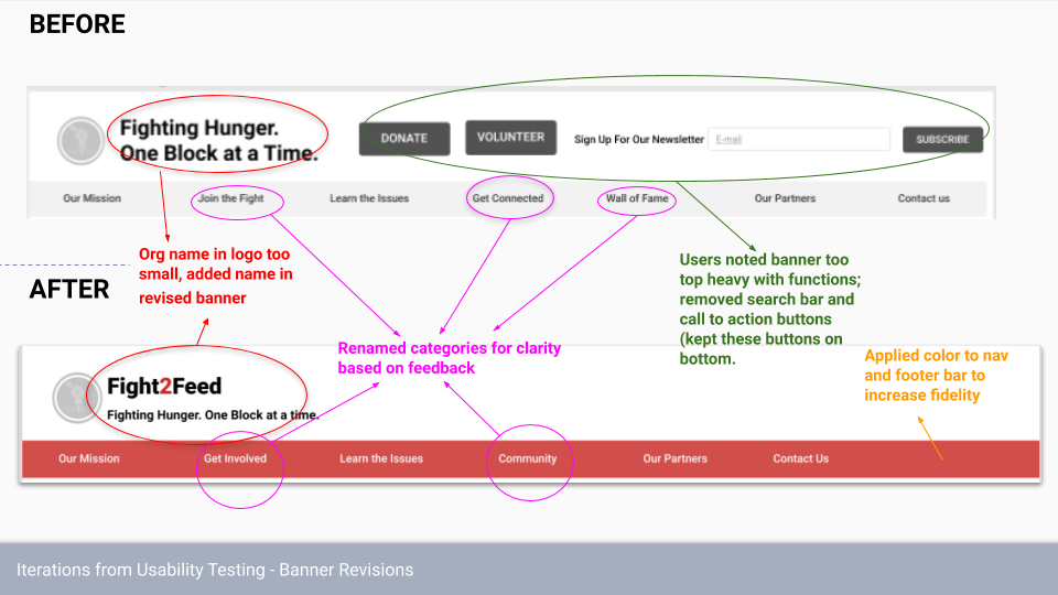
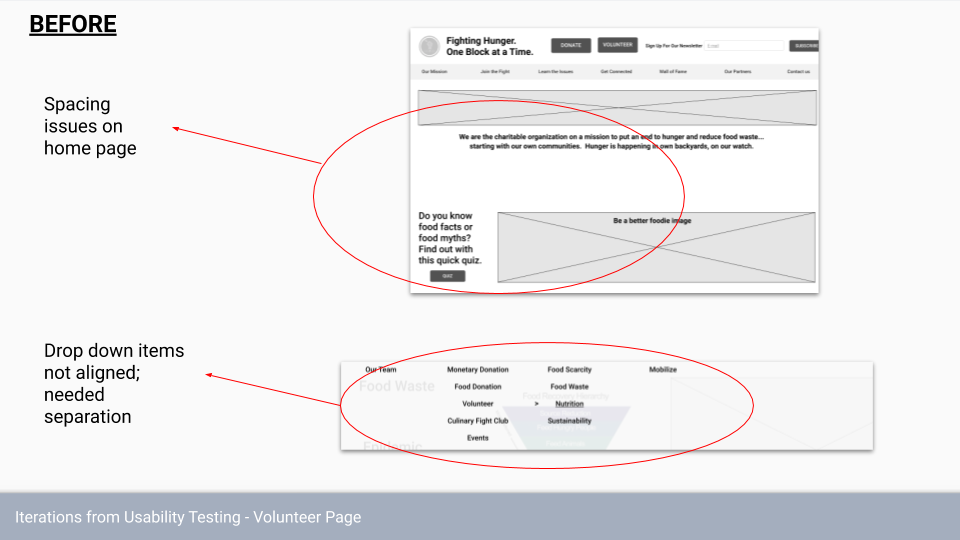
after usability testing with 5 participants, we got some good feed back on aproving some of the uses with the navigation, the layout and the functionality
Prototype:
Results and Reflections:
I'm very proud of what we built in the end and how the process went down, it was my first time working in a group on this sort of project, and while it was difficult at time we learned the value of each others differences while also learn how to reign each other in if something went to far. ultimately the process was easy on each one of us and i think that's the point of working in a team, to equally distribute the work so you can get more done with less effort.
The project it self could use more polish, an important goal was the make the site with a responsive design, and I don't think that was done as well as I'd like. So I want to improve that about the site.
